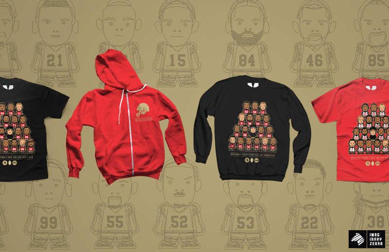
*This is not an official apparel for the San Francisco Giants. It is, however, a design inspired by the SF 49ers.
I wouldn’t say I bleed red and gold, but I’m certainly a big supporter of my local team. 49ers have made a pretty good run so far and they better take home the trophy! It’s been almost 20 years since their last championship and I think it’s about time to renew that record. Who’s got it better than us? NOBODY! 
To celebrate the hardwork by our 9ers, Marvin (MKP) and I teamed up again to pump out a design for the occasion. Here’s the breakdown from head to toe of how we came up with the design:
First started with our Imaginary Zebra (Zeeb Character) template. It’s come a long way. I started making these back in ’08 and this is the current version after dozens of revision and polish.
The main adjustment for this particular is the jersey style. This would be the same throughout all the characters I’ll be making for the Niners.
Then, it’s the color palette:
For screen printing, there’s a limitation for color. Not too much on the technical side of things, but financial side of things. The more colors = the more expensive. So it’s important to cut the colors down to only the critical ones and optimize those for the final design. Good thing most teams have only two, if not one, colors as the primary scheme.
Next is to figure out the amount of space we have on our garments.
Note that there’s male and female sizing, therefore, the space is only as big as your smallest shirts.
With the limited room for design, we had to CUT DOWN the players to only the most significant ones for the graphic.
Whether a player’s a good/significant one is highly subjective, so here are the ones Marv and I decided to keep. We’ve heard many requests to add other players, but with the amount of room and time it’d take to include, we had to regrettably say that this would be the final list:
Now, onto the characters:
To customize the players, there are a few key points to pay attention to: The shape of head, ears, facial feature placements, hair, and signature features (tattoo, jewelry, outfit..etc)
Quick example: Jim.
And a few others:

All the characters were individually designed via Illustrator.
And the placements were set using Photoshop.
We like the signature red and gold, but simply couldn’t leave out the black. So we came up with 2 color ways for this design: Home and away jerseys on black and red garments.
Back design:
Now available in 3 different styles—tees, zip-ups, and crewneck sweaters.
These items are for pre-order only.
You can pre-order them here.
’til next time,
-Benson


