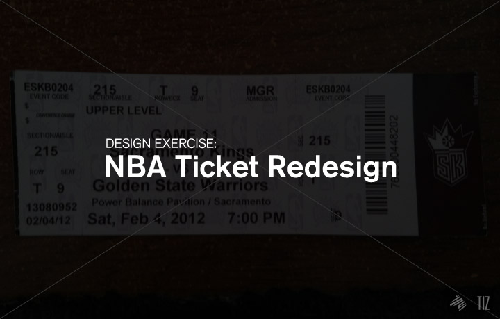

There are plenty of things out there that are beautifully and intelligently designed – NBA tickets aren’t one of them.
Inspired by the Boarding Pass FAIL project by Tyler Thompson, this is an exercise that I came up with to allow participants to think critically on the importance of info and the visually friendliness of the layouts. Hopefully by partaking in this project, one can extend their perspectives and rethink the way how anything’s designed.
In this case, the mind behind this redesign exercise is Taylor Fulwiler, our latest design intern.
↑She’s a second-year student at UC Davis working towards her BA in design (with an emphasis on visual communications). You guys will see plenty more of her work in the near future.
I briefed her quickly:
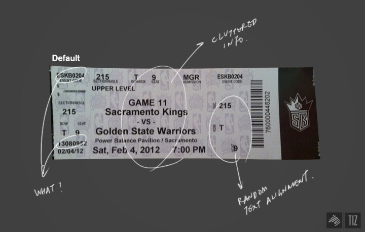
It’s confusing and, frankly, quite hideous, relatively when compare to the NBA enterprise. NBA’s got great commercials and terrific branding (teams, web platform, related accessories). It’s where amazing happens, how could they allow such ticket design?!
That’s me ranting. Unlike me, Taylor put her ideas into action and created a several versions of the NBA ticket.
————————————————————————————————————————————
This is what she came up with: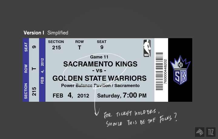
“I kept it pretty simple due to the fact that it’s main purpose is to provide information. For text, I made sure the teams playing were the most dominant, followed by the date/time and the seating. I used a simple typeface that’s easy to read, made the layout pretty straightforward and omitted information that tended to be repeated too much. I also used the Sacramento Kings’ team colors, but made sure to use them in a way that allowed the information to be read easily without being an eyesore. I also chose to omit the background pattern, as I felt it was unnecessary and only made the ticket seem more cluttered.” – Taylor
I, then, sent her the boarding pass examples and asked her to rethink some of the attributes of the tickets:
“Few notes from the boarding pass examples:
————————————————————————————————————————————
After reevaluating the info on the ticket, she designed this: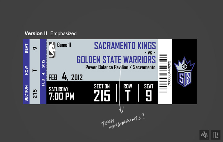
“So after looking at my first redesign, I admit that I was more focused on the function of the ticket (being able to provide information in a clean and simple way) rather than its aesthetics.
5.) I wasn’t really a fan of the personal sentences, due to the unnecessary words getting in the way of processing the important information. I feel that short, sweet and to-the-point is more effective in this situation, as basketball goers are more concerned with getting to their seat, getting their food, souvenirs, etc. They don’t have time to kill (unlike passengers, who may be waiting for hours), so I feel like they would not want to waste time “reading” their ticket for crucial information. As for the diagrams, I tried them out but I didn’t think they worked well, so I ultimately decided to omit any diagrams.” – Taylor
I went “A few more things to consider:
————————————————————————————————————————————
Finally, she ended up with this: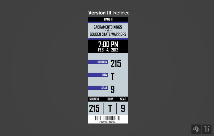
“For this rendition I chose to have more fun and change it to a vertical layout. As a result, I did not have to worry about the whole people reading left to right aspect as most things were centered. After looking at the example you showed me, I really liked the idea of keeping the info on the ticket as minimal as possible, so I ultimately decided to eliminate the location (pavilion) and the day of the game (Saturday). Finally, I took out the logo. I figured in reality the logo can simply be placed on the back of the ticket (on what I hope would be a full-colored background to compliment the colors on the front of the ticket).
————————————————————————————————————————————
What do you guys think?
till the next redesign,
-Benson|| Twitter || Facebook || 365. || Shop of Imagination ||

